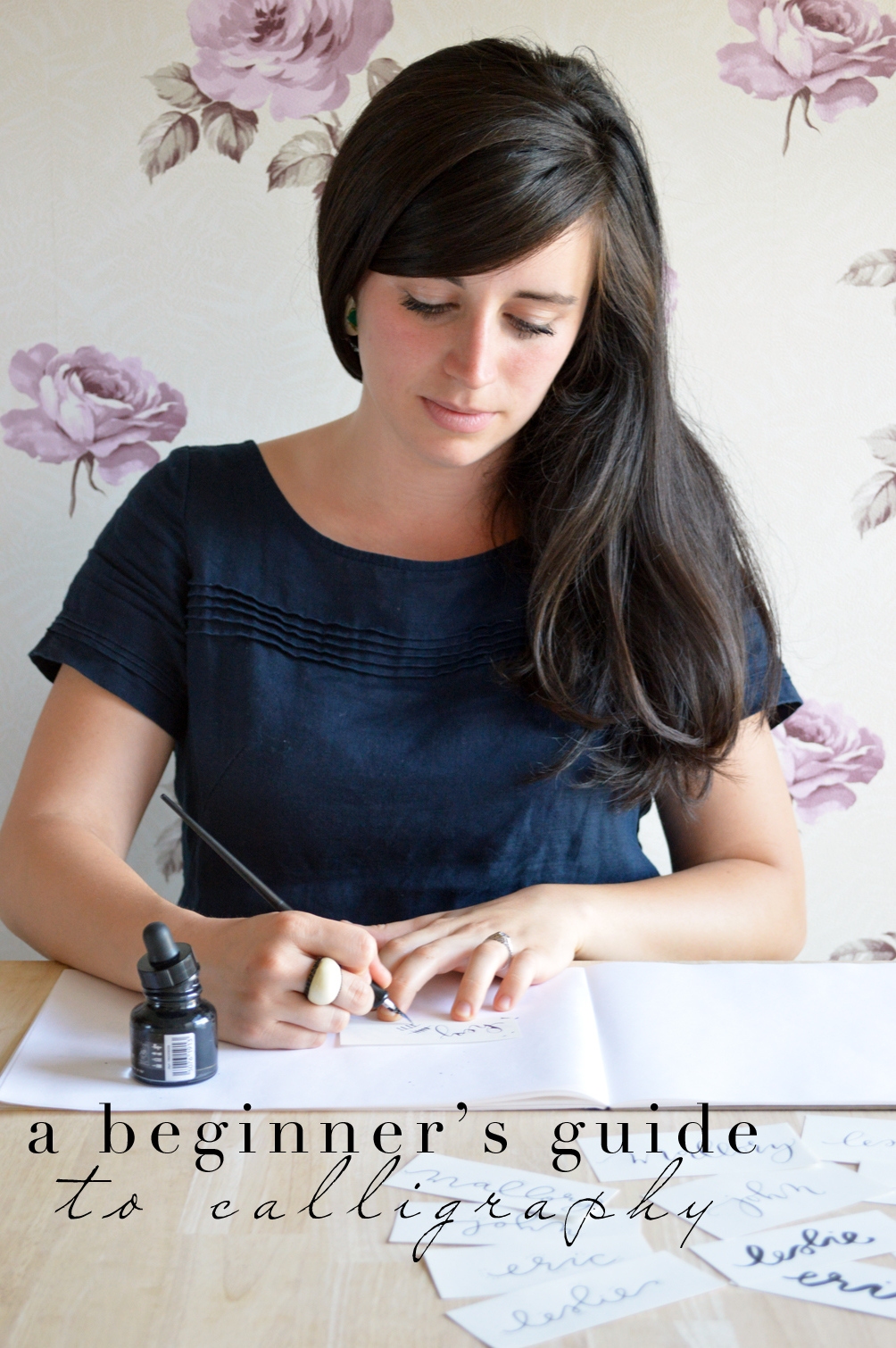
I’m a highly competitive person. Not in a really obvious way, though. It’s more this passive youngest-sibling-of-five feeling that I should be best at everything. So maybe one of my biggest adulthood lessons has been to recognize, that’s not true! Not only is it not true, but it’s also an unhealthy mindset. It put me in a position of resenting the talents of others instead of celebrating them. My dear college roommate, Mallory, is one person I truly have to thank for changing my mental habit. She is a treasure and so incredibly talented. She finds beauty and creates loveliness in whatever she’s doing. And recently she launched a calligraphy business out of Boston called Castle Paper Co. I was so excited to tap her expertise and get a beginners guide to calligraphy to share with you. See her simple tips below and a giveaway!
The Concept
The difference–in my mind–between calligraphy and hand lettering is that for calligraphy, you use a pen with a nib. For hand lettering, you use literally anything else–crayons are an acceptable medium. What distinguishes modern calligraphy from the more traditional, well-known forms of calligraphy like the Declaration-of-Independence-esque styles such as Copperplate or Edwardian, is that it is created according to a unique and self-crafted style, rather than in keeping with specific pen strokes and hand movements. Simply put, it is more free form, and there are guidelines rather than rules. The great thing about this is, there really isn’t a wrong way to do it!
The Guidelines
- Apply pressure to the downstroke, and lighten up on the upstroke. Don’t think about which lines need to be wide or narrow, just apply and release pressure, and it will happen naturally.
- I learned from Molly Suber Thorpe’s book, Modern Calligraphy, that you want your pen to be somewhere between a 35 and 45 degree angle with the page. Also, sit up straight, don’t hunch over! (This is particularly hard for me. I like to be inches away from my page as I write, but as Molly says, you can’t work like that for hours!)
- Just try stuff. For some of you, this is going to look like writing the same letter over and over again. For others of you, it’s going to be writing words or phrases or lyrics to that song stuck in your head or your life mantra. Whatever works for you, don’t be afraid to just try! Of course, paper is not an unlimited resource. You can use any scrap of paper available to you when you are practicing for form, not finished product. Eventually, the envelope from your bank statement will not be your bread and butter, but it can be for right now, because guess what? No one else is going to see it! So you get to just breathe normally and have fun playing around.
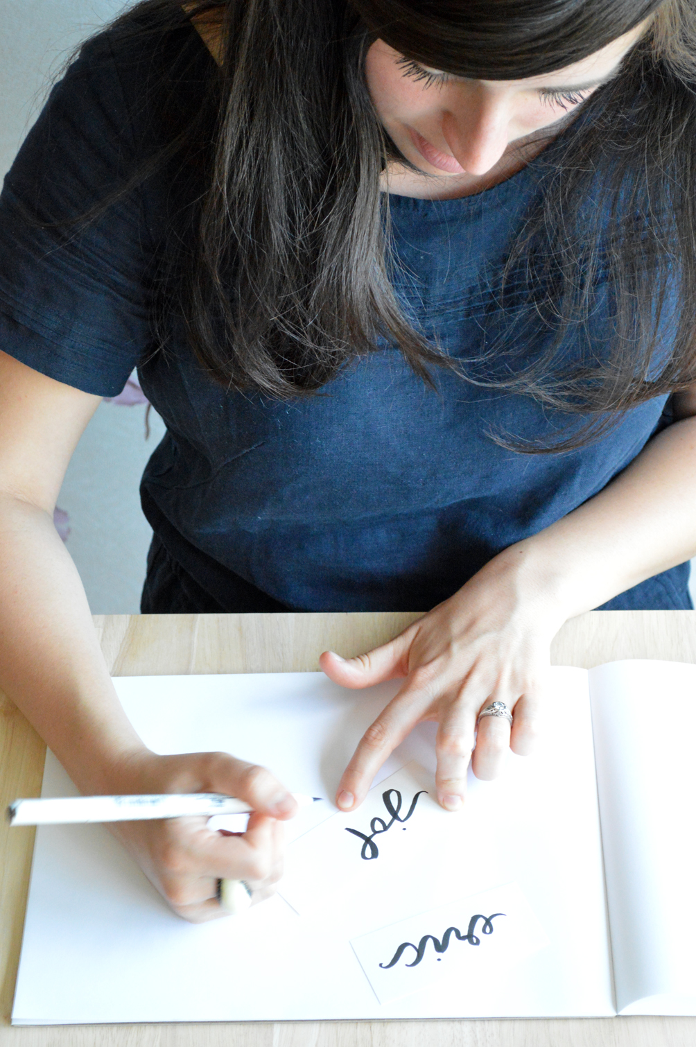
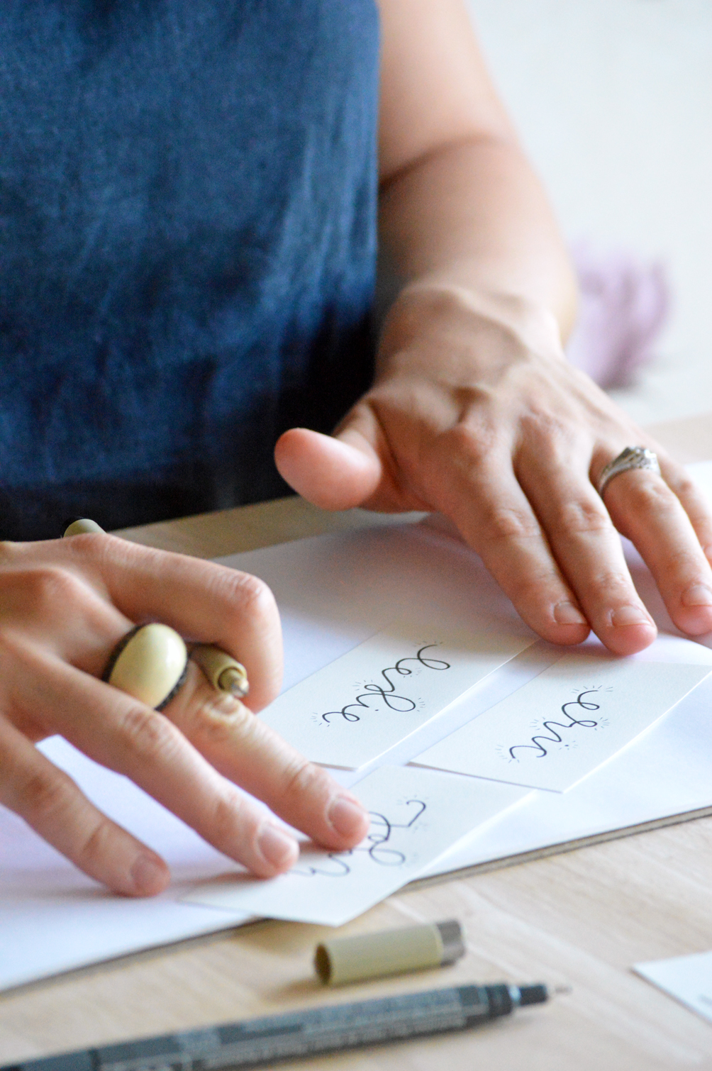
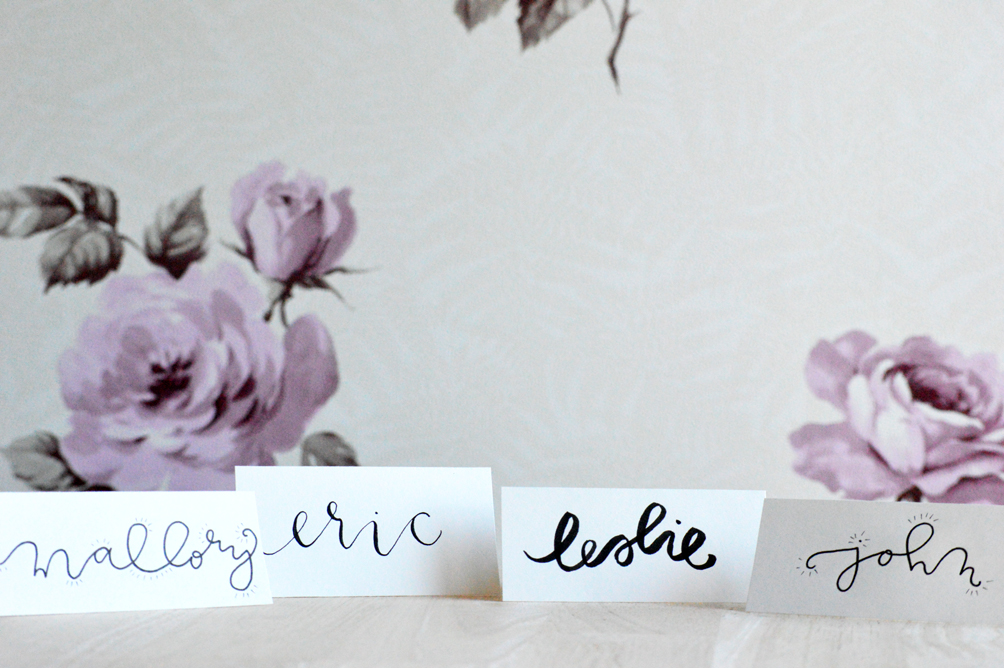
Project No. 1
Place cards! They’re a simple way to make your table lovely and welcoming, and if you start anywhere, let it be here. It’s just one word, maximum, two. Here are three mediums you can use to make a lovely place card in sixty seconds or less.
Brush Marker
- If you are a person who bears down really hard when you’re writing, you’ll want a brush marker that is more sturdy, and likely, shorter (on the actual brush tip itself). If you have a very light bearing you can go with something longer and more flexible.
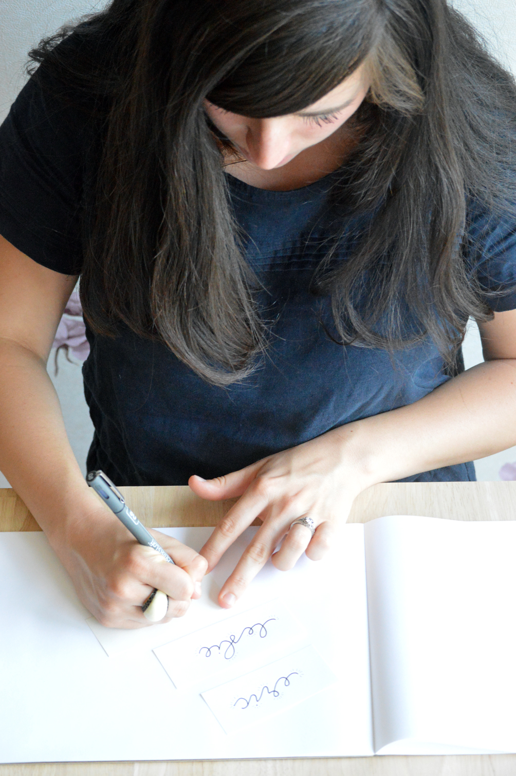
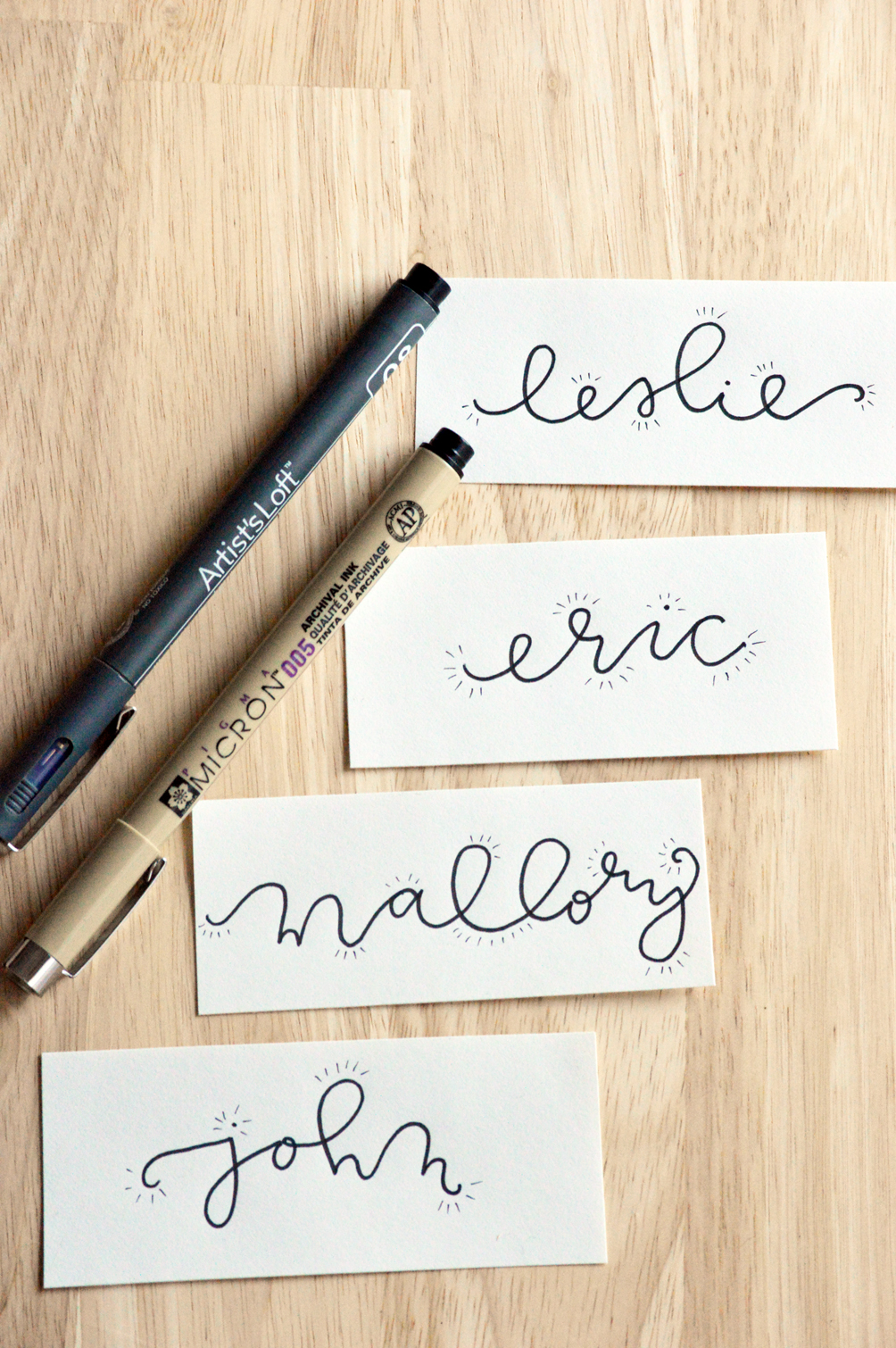
Felt Pen
- There is no limit to my love of felt-tip pens. If you are wary of the thin line to thick line transition, using something like this will eliminate that effect, so you can focus singularly on the shape of your letters, the height, the slant, the variation–all of the above. They’re great for practicing and playing around with your personal lettering style.
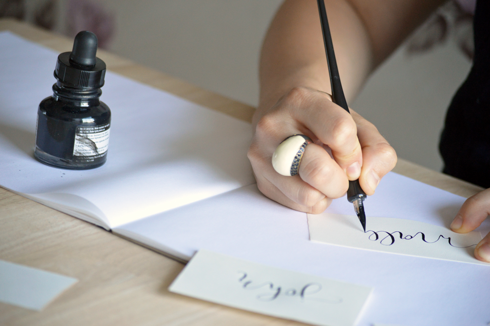
Nib & Ink
Here are a few quick tips that will help you not to feel overwhelmed by starting with something so new. It’s not as complicated as it looks, and it’s a lot of fun!
- Go slow. Slower than seems necessary. It will help you to observe the translation of movement into marks on the page, and also it is important to go slow so that you don’t run out of ink too fast!
- I’ve read that you shouldn’t dip your nib into the ink…true that using a dropper gives you somewhat more control over how much ink you’re putting on the nib, but I think it’s a matter of preference. I prefer to dip the nib when using thinner ink, and to use a dropper for acrylic-based inks that are thicker.
Some Fabulous Resources:
This skillshare class by Molly Jacques: http://www.skillshare.com/classes/design/Introduction-to-the-Art-of-Modern-Calligraphy/875897554
“Modern Calligraphy”, by Molly Suber Thorpe (linked above)